Envelope: Building a sub-brand
for a smart building platform
Brand Strategy · Visual Identity · Armstrong Fluid Technology
With Unmesh Kulkarni, Brand Strategy · Wei Wang, Visual Design

The Strategic Challenge
Armstrong Fluid Technology had spent decades earning trust as a world-class maker of pumps and HVAC equipment. But a new class of opportunity was emerging — one that went beyond individual components to the intelligence that flows between them. Armstrong had developed a suite of optimization solutions capable of managing performance at the equipment, plant, and enterprise level simultaneously. The parent brand, strongly associated with pumping hardware in customers' minds, couldn't carry that story on its own. A new brand was needed — one that could stand alongside names like Honeywell Forge and signal that Armstrong was now competing in a different league.
Audience and Context
The people Envelope needed to reach — building owners, facility managers, controls contractors, and consulting engineers — were already familiar with sensor-based building intelligence. The prevailing belief in the market was that sensors distributed throughout a building were the primary source of optimization insight. What Armstrong knew, and needed the market to understand, was that the real breakthrough happens when equipment itself becomes intelligent. When an Armstrong pump understands flow, and that understanding is shared across a connected plant, the results dwarf what sensors alone can achieve. Envelope needed to make that case credibly to an audience that had heard many platform promises before.
Brand Platform
The core idea behind Envelope was interoperability delivering outcomes that no single component could achieve alone. Platforms create network effects — they enable new products, new services, and deeper relationships between producers and customers over time. The territory Envelope needed to own was precisely this: the unlocking of system-level performance that happens when Armstrong's intelligent equipment integrates with partner solutions. An Armstrong pump paired with a chiller or cooling tower, operating as a unified system, achieves efficiencies at a scale that isolated optimization never could. Envelope's promise was comprehensive — covering equipment, systems, and enterprise levels — with a name that carried meaning on multiple levels: the building envelope, pushing the envelope, and the sense of containing and protecting what matters most.

Naming and Nomenclature
The name Envelope wasn't invented from scratch — Armstrong had been using "Design Envelope" as a product line name for nearly a decade. The strategic insight was to elevate it. By stripping it back to simply Envelope, the name could operate at a grander, platform level, with Design Envelope sitting beneath it as the equipment tier. This created a natural nomenclature architecture: Design Envelope at the component level, and Envelope — with its sub-brands Core, Advisor, and Optimizer — at the systems and enterprise levels above it. The same founding conception, expressed at a larger scale.

The logo
The Envelope symbol evolved directly from the Design Envelope mark — a geometric form already familiar to Armstrong's market. The key change was a notch, or fold, that gave the new symbol a three-dimensional quality, signalling the step up from product to platform. Visual continuity was intentional: customers who knew Design Envelope could recognise the lineage, while the new form communicated something more expansive.

The strands
The strands motif began as a single graphic element created by an outside creative agency for an early Envelope application. Most people saw it as a decorative border — I saw something else. Isolated at the edge of a layout, the strands weren't able to do what they were capable of. I commissioned an artist to liberate them — to develop a full family of strand compositions that could float freely, behave organically, and be deployed across any application. The brief was to capture the interplay of the forces Envelope manages: heating in red, cooling in blue, data in grey and black. The test for whether a strand composition worked was whether it felt alive — whether the curves, tapers, and undulations had a natural character, and whether the colours played together in a way that felt dynamic rather than decorative. The result was a motif versatile enough to anchor a trade show environment, animate a product video, or add texture to a digital ad.


Systems in use
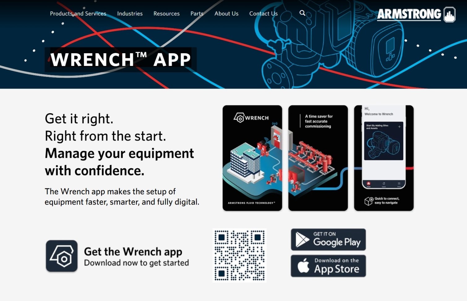
With the brand foundations in place, Envelope came to life across every customer touchpoint. Digital ads carried the strands motif into programmatic campaigns, translating the brand's energy into formats designed to stop a scroll. Video brought the strands into motion — animating the interplay of heating, cooling, and data flows in ways that static design couldn't achieve. Print materials and trade show applications gave the brand physical presence, while the Envelope landing page on Armstrong's website became the primary destination for customers ready to learn more.



Launch & lessons
The Envelope launch revealed something every brand strategist should expect in a B2B organisation — a new name alone isn't enough. For many in the sales team, Envelope was initially just another brand to navigate rather than a platform to believe in. Two corrections made the difference: adding "By Armstrong Fluid Technology" beneath the wordmark gave customers a recognisable anchor, and developing a plain-language explainer that named each platform component directly replaced abstraction with clarity. Both decisions reflected a principle that holds across B2B brand strategy — a sub-brand only earns its independence once the organisation behind it fully understands what it stands for.